MatplotlibおよびPlotly Charts
Matplotlib
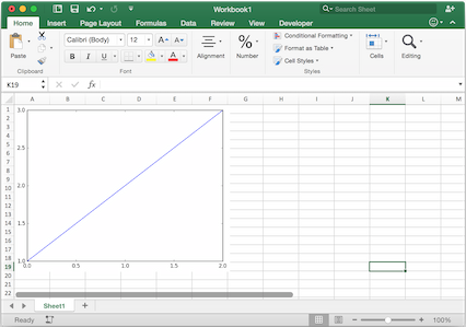
Using pictures.add(), it is easy to paste a Matplotlib plot as picture in Excel.
はじめに
The easiest sample boils down to:
import matplotlib.pyplot as plt
import xlwings as xw

fig = plt.figure()
plt.plot([1, 2, 3])

sheet = xw.Book().sheets[0]
sheet.pictures.add(fig, name='MyPlot', update=True)
注釈
If you set update=True, you can resize and position the plot on Excel: subsequent calls to pictures.add()
with the same name ('MyPlot') will update the picture without changing its position or size.
注釈
If you get the following warning UserWarning: Starting a Matplotlib GUI outside of the main thread will likely fail., make sure to set the Matplotlib backend before using any Matplotlib/Pyplot code: import matplotlib as mpl and mpl.use("agg").
Excelとの完全統合
Calling the above code with RunPython and binding it e.g. to a button is straightforward and works cross-platform.
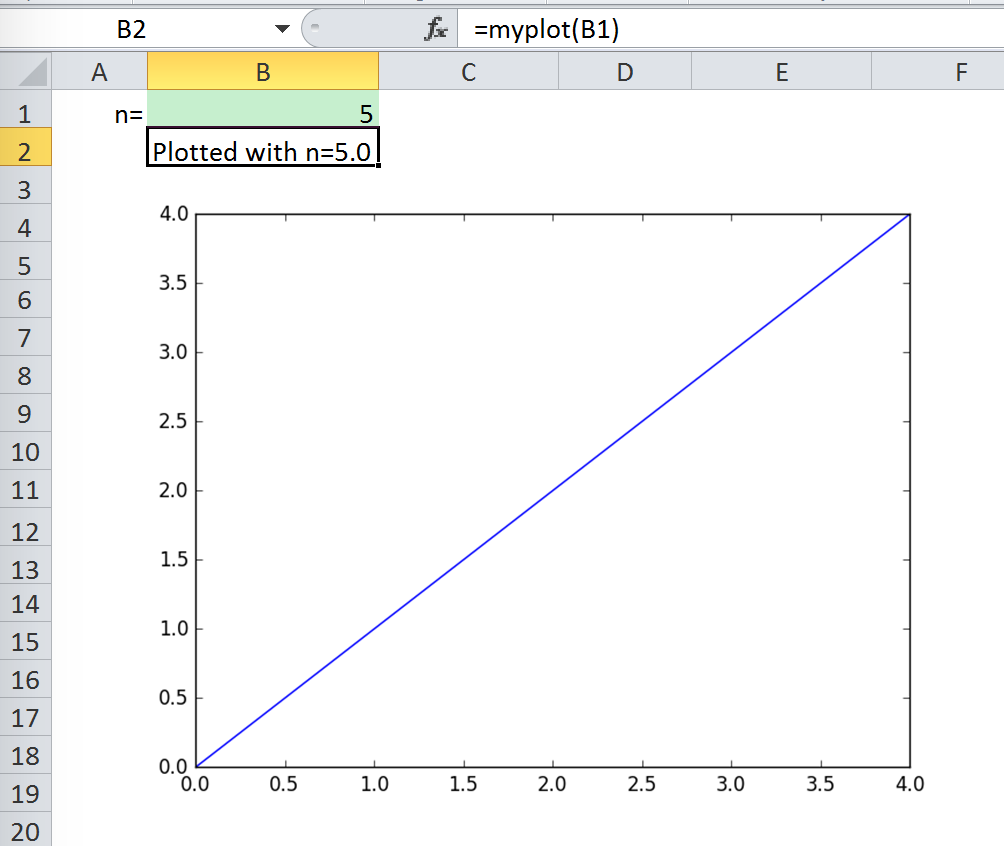
However, on Windows you can make things feel even more integrated by setting up a UDF along the following lines:
@xw.func
def myplot(n, caller):
    fig = plt.figure()
    plt.plot(range(int(n)))
    caller.sheet.pictures.add(fig, name='MyPlot', update=True)
    return 'Plotted with n={}'.format(n)
この関数をインポートしB2セルから呼び出せば、B1の値が変わるたびに図は自動的にアップデートされます。:
プロパティ
Size, position and other properties can either be set as arguments within pictures.add(), or
by manipulating the picture object that is returned, see xlwings.Picture().
For example:
>>> sht = xw.Book().sheets[0]
>>> sht.pictures.add(fig, name='MyPlot', update=True,
                     left=sht.range('B5').left, top=sht.range('B5').top)
or:
>>> plot = sht.pictures.add(fig, name='MyPlot', update=True)
>>> plot.height /= 2
>>> plot.width /= 2
Matplotlib fitureの取得
Here are a few examples of how you get a matplotlib figure object:
via PyPlot interface:
import matplotlib.pyplot as plt
fig = plt.figure()
plt.plot([1, 2, 3, 4, 5])
or:
import matplotlib.pyplot as plt
plt.plot([1, 2, 3, 4, 5])
fig = plt.gcf()
via object oriented interface:
from matplotlib.figure import Figure
fig = Figure(figsize=(8, 6))
ax = fig.add_subplot(111)
ax.plot([1, 2, 3, 4, 5])
via Pandas:
import pandas as pd
import numpy as np

df = pd.DataFrame(np.random.rand(10, 4), columns=['a', 'b', 'c', 'd'])
ax = df.plot(kind='bar')
fig = ax.get_figure()
注釈
When working with Google Sheets, you can use a maximum of 1 million pixels per picture. Total pixels is a function of figure size and dpi: (width in inches * dpi) * (height in inches * dpi). For example, fig = plt.figure(figsize=(6, 4)) with 200 dpi (default dpi when using pictures.add()) will result in (6 * 200) * (4 * 200) = 960,000 px. To change the dpi, provide export_options: pictures.add(fig, export_options={"bbox_inches": "tight", "dpi": 300}). Existing figure size can be checked via fig.get_size_inches(). pandas also accepts figsize like so: ax = df.plot(figsize=(3, 3)). Note that "bbox_inches": "tight" crops the image and therefore will reduce the number of pixels in a non-deterministic way. export_options will be passed to figure.figsave() when using Matplotlib and to figure.write_image() when using Plotly.
Plotly static charts
前提条件
In addition to plotly, you will need kaleido, psutil, and requests. The easiest way to get it is via pip:
$ pip install kaleido psutil requests
or conda:
$ conda install -c conda-forge python-kaleido psutil requests
使い方
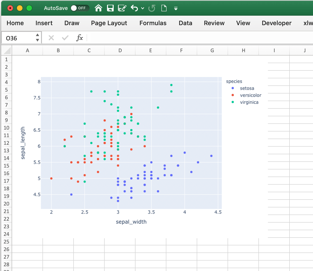
Matplotlibと同じように機能しますが、Plotlyチャートの描画は少しだけ時間がかかります。以下がサンプルです:
import xlwings as xw
import plotly.express as px

# Plotly chart
df = px.data.iris()
fig = px.scatter(df, x="sepal_width", y="sepal_length", color="species")

# Add it to Excel
wb = xw.Book()
wb.sheets[0].pictures.add(fig, name='IrisScatterPlot', update=True)